Product Design

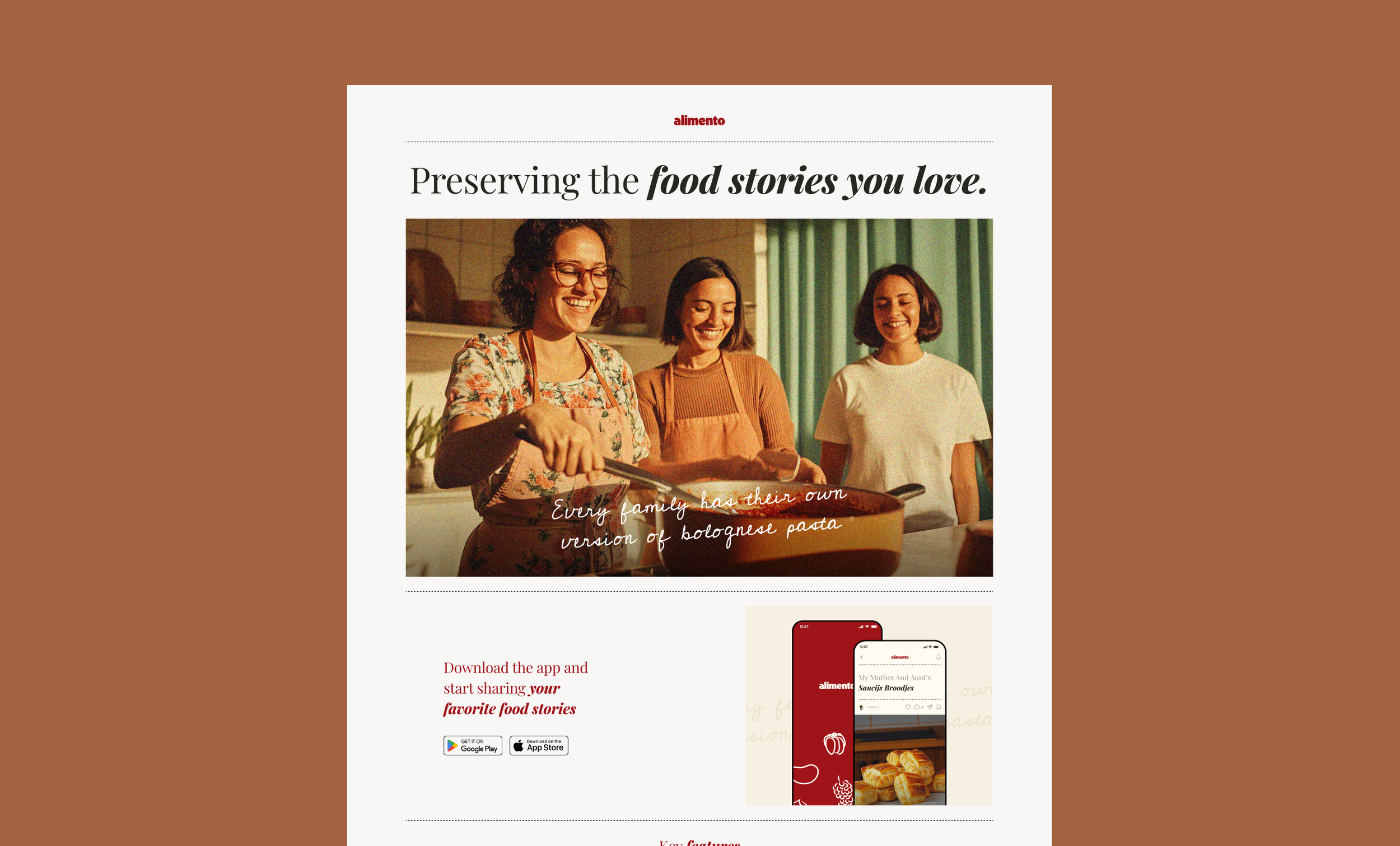
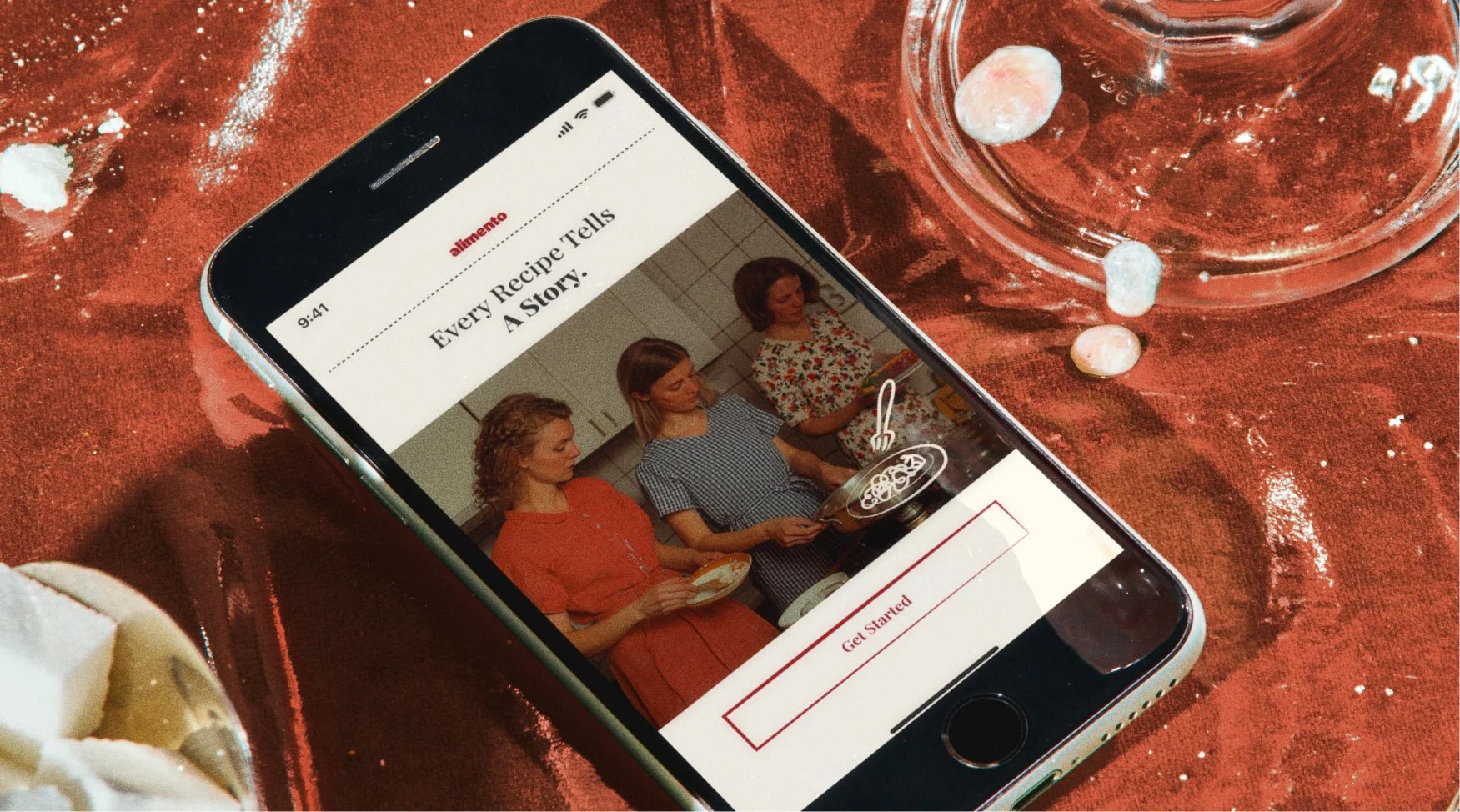
Alimento is a mobile app designed to help users preserve and share personal and family recipes through emotionally rich, story-driven pages. Unlike traditional recipe apps, Alimento blends practical functionality with editorial design; turning each dish into a curated narrative that highlights the people, memories, and culture behind it.
By structuring the experience like an elegant magazine, we aimed to increase emotional engagement and make it easier to share and revisit these stories over time. This approach supports both long-term user retention and organic sharing, giving the product a strong foundation for community growth.
Role
Product Designer and Brand Designer
Company
Inflow
Date
December 2024 - February 2025

Project Snapshot
Scope: UI/UX, brand identity, illustration system, design system
Goal: Turn personal, non-digital recipes into shareable, editorial-style stories
Team: Me (Designer), PM, Client Stakeholders
Strategic Priorities:
Make story creation intuitive and personal, even without media
Balance editorial design with scalable layout and structure
Equip non-technical users with tools to publish beautiful content
Success Metrics (post-launch targets):
% of users completing and sharing at least one food story
Time spent per session
Repeat usage (returning to upload more stories)
The Challenge
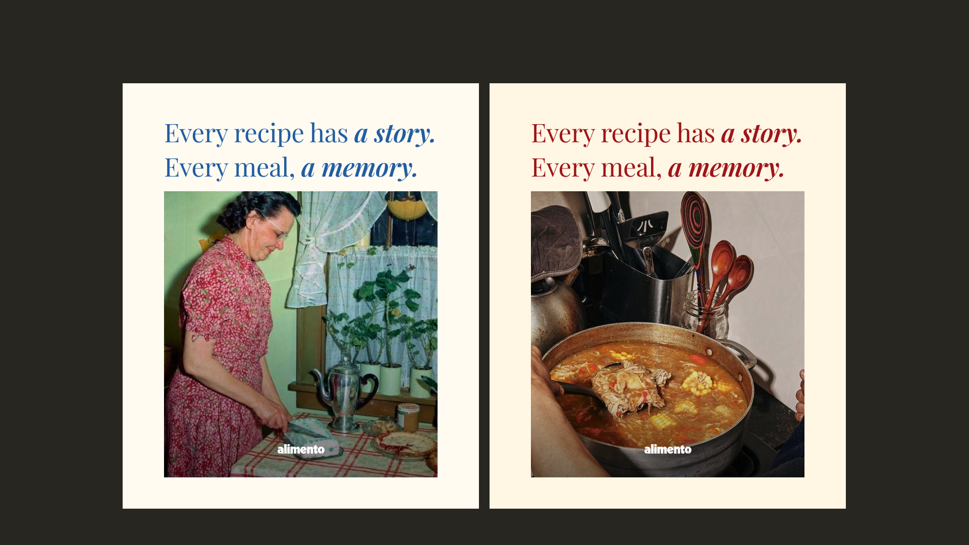
Alimento is a mobile app concept with a heartwarming mission: to help users preserve, organize, and share personal and family recipes as immersive, story-driven experiences. The client envisioned more than a traditional recipe manager; Alimento needed to feel like an elegant editorial magazine, where each food story placed the author and their heritage at center stage. Recipes weren't just instructions—they were cultural snapshots, memories, and legacies. Think of a mom, aunt, or grandmother being the model on the cover of a beautifully curated spread.
How could we merge that editorial aesthetic with a deeply personal, accessible platform for users who might not have ideal content (like professional photos) to work with?
How do we make a recipe page feel beautifully crafted when a user might only have a grainy photo or none at all?

My Role
I led the end-to-end design of Alimento — owning the UI and UX, brand identity, illustration design, and design system. Starting from early wireframes and a loose concept, I helped shape the product from the ground up into a fully realized experience. Beyond visual design, I also defined the structure of the user flows, mapped functionality to storytelling goals, and created scalable systems for recipe export, media flexibility, and editorial layout.

The Process
Before diving into structure and visuals, I spent time gathering insights from both the client and early user interviews.
Discovery and Research
The goal was to define what “personal, editorial storytelling” really meant to our audience ; and how we could make it functional, scalable, and emotionally resonant.
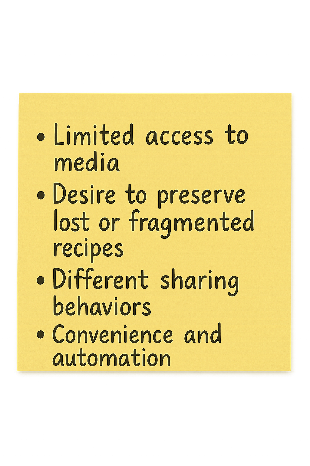
From interviews with potential users (women aged 35–60+), we uncovered a few key needs:
Limited access to media: Many didn’t have quick access to photos of their relatives, the dish, or the original handwritten recipe, which made them hesitant to share.
Desire to preserve lost or fragmented recipes: Some users wanted to recreate dishes based only on memories of how it tasted, not exact instructions.
Different sharing behaviors: Older users leaned toward printable exports they could gift or archive, while younger users wanted to share digitally across social platforms or messages.
Convenience and automation: Uploading a photo of a handwritten recipe and having the app extract ingredients and steps via AI was a feature that consistently resonated.
On the client side, we had deep conversations about balancing editorial beauty with functional usability. They wanted a polished, magazine-style story page, but also envisioned giving users complete control — including custom stamps for recipe origins, unlimited captions, and free-form layouts.
I proposed a more scalable structure:
A guided form that mirrored the visual layout of the final story, turning the experience into a “fill-in-the-frame” model rather than open-ended input.
A controlled visual language using curated illustrations instead of flags or cultural symbols, allowing users to represent dishes flexibly without cultural reduction.
Implementing character limits, image placement rules, and styling defaults to help stories stay on-brand, elegant, and easy to export — while still feeling deeply personal.
This phase was critical in helping us shape the constraints that made the design not only functional and emotionally resonant, but also scalable as a product.
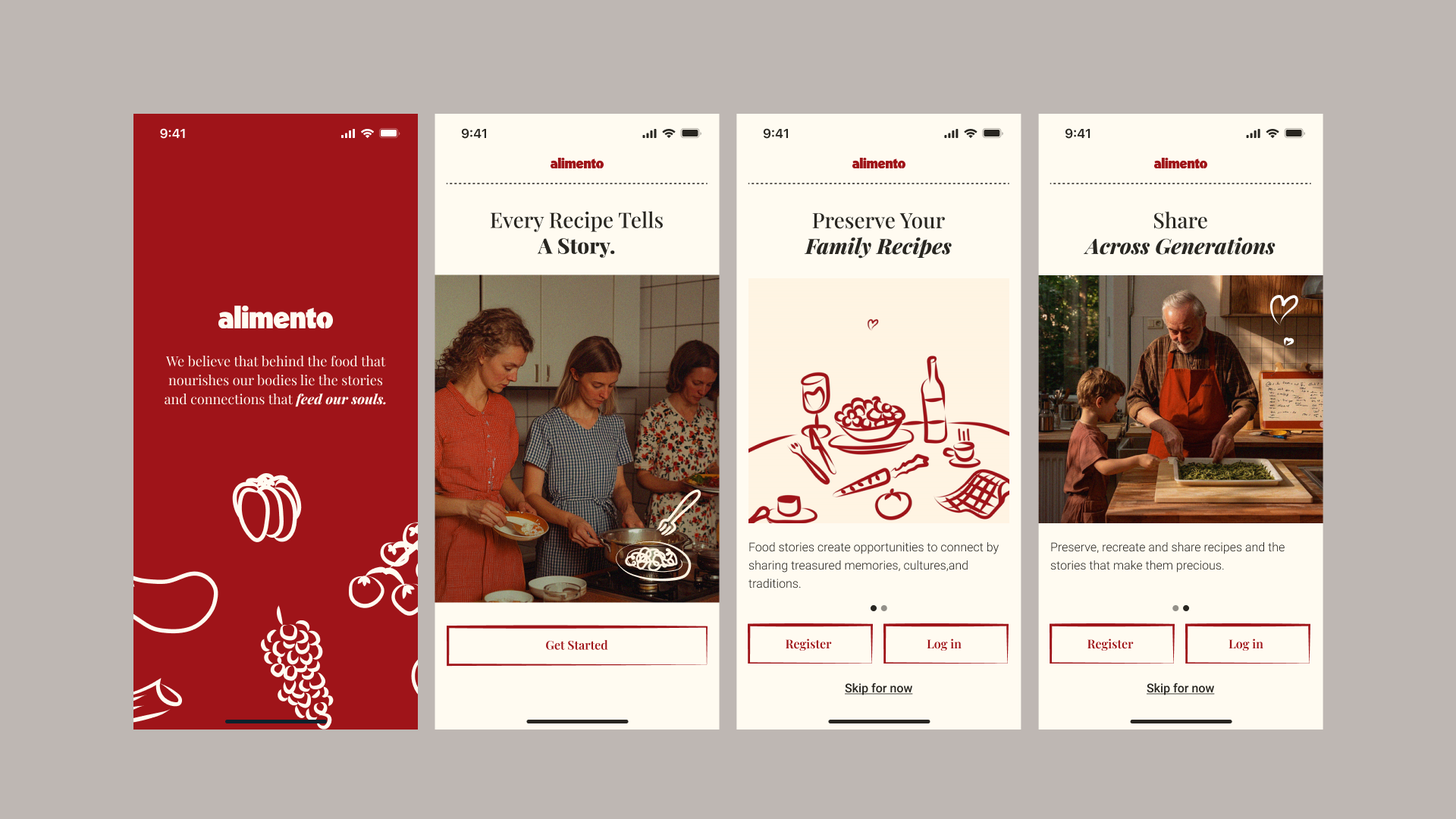
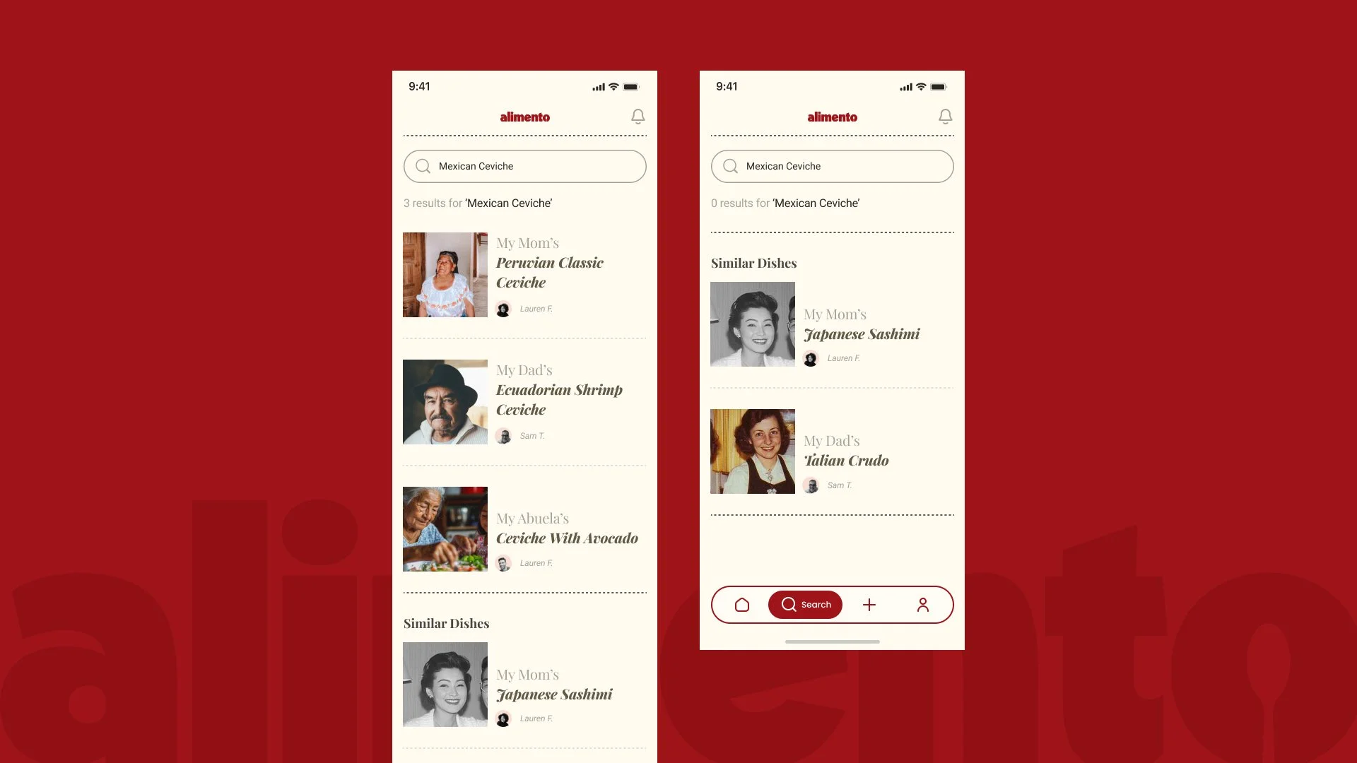
Step 1: Structuring the Food Story
We divided the core form into two sections:
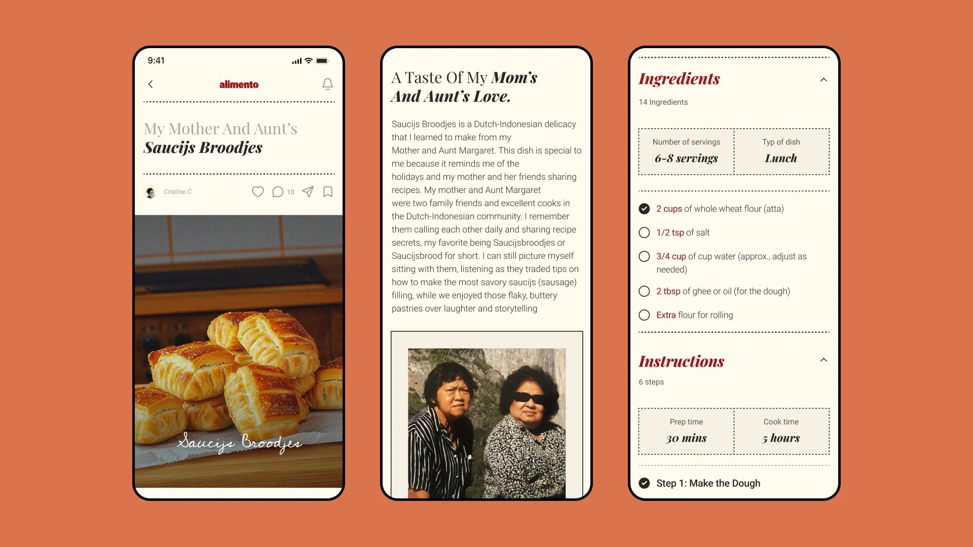
The Story Form asked emotionally driven questions: who taught you this dish, what makes it special, do you have a quote from the author, can you upload any related photos?


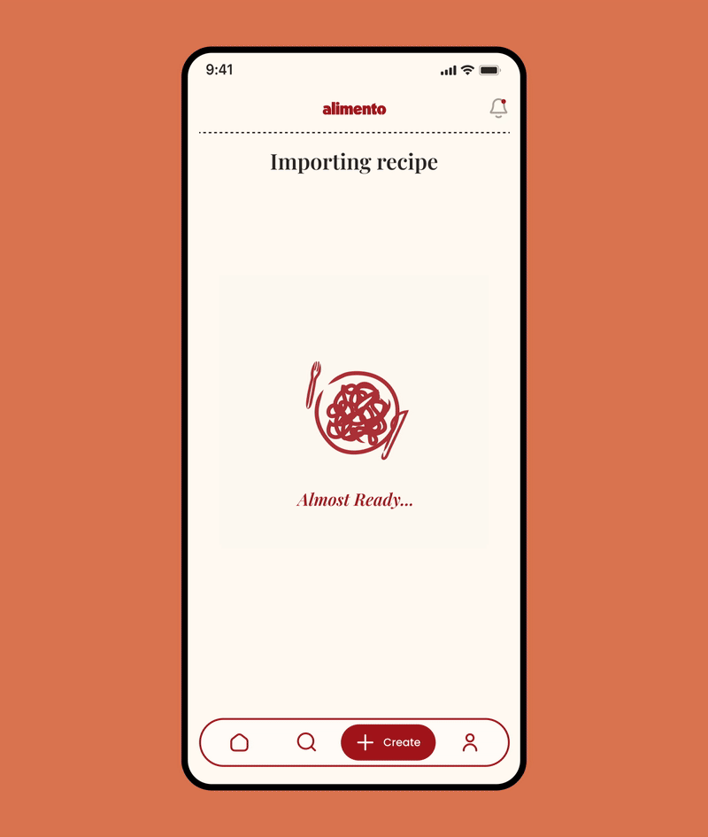
2. The Recipe Form gathered traditional inputs: ingredients, prep/cook time, instructions, type of dish, and so on. Users could input this manually, upload a photo to extract recipe data via AI, or paste a URL that would auto-populate the fields


Step 2: Designing for Accessibility and Elegance
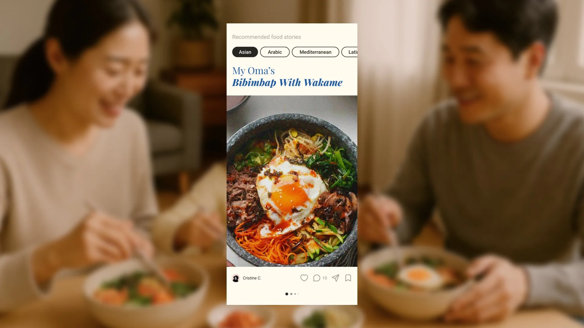
We designed a standardized template for the food story page to ensure consistency and elegance across different user entries. Each recipe featured:
A cover image with a short handwritten-style caption
A quote and portrait of the recipe's author (styled like a postcard)
A visual carousel of user-selected photos or illustrations
A custom "dish stamp" chosen from an in-app gallery of hand-drawn icons
Ingredients and steps, designed in an easy-to-scan layout inspired by apps like Crouton


We also added thoughtful UI details, like scrollable Apple-style dropdowns for cook/prep time, and a custom keyboard for quickly selecting measurements.


Step 3: Media Flexibility
We divided the core form into two sections:
Upload personal images
Choose from a gallery of prebuilt illustrations (for a hand-crafted vibe)
Pull from a stock image library

The option to include illustrations ensured each page felt complete, even in the absence of personal media, while maintaining Alimento’s elegant brand identity.

Step 4: Sharing and Exporting
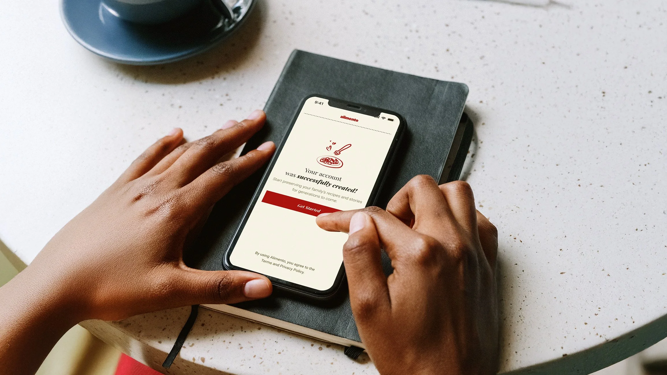
A key feature of Alimento was the ability to export stories—either digitally (via shareable links or social media posts) or for print. The print version used a US Letter format with a magazine-like layout, designed to be a foldable, double-sided page that maintained the elegance of the digital version.


Users could preview and revise content before exporting, allowing them to change images, change the colors of illustrations and edit their quotes.


The Outcome
The app was fully designed and is currently pending development funding. From a product strategy perspective, I helped define early KPIs to measure engagement and success post-launch, including:
% of users completing and sharing their first story
Average time spent per session
Repeat visits or story uploads per user
The client responded positively to the design, noting that it reflected the emotional resonance they had envisioned. The final system balanced aesthetic integrity with user-generated content, enabling non-technical users to create beautiful, structured stories.
This project was one of the most multi-layered I’ve worked on — balancing editorial polish with personal flexibility often felt contradictory. But we found creative ways to make it work: using hand-drawn illustrations to fill visual gaps, providing pre-curated content, and keeping the UI grounded in structure.

The biggest insight?
Users don’t need to be designers to tell a beautiful story—you just need to give them the right tools.

Join the waitlist and be among the first to know when the app is out!


Want to see more?